
Free data visualization tools are essential for converting complex data into visually appealing and perceptible insights. They enable people and organizations to evaluate and comprehend data to make defensible judgments efficiently.
While there are many expensive data visualization tools on the market, there are also many great, feature-rich, free alternatives perfect for people on a budget or who want to experiment with data visualization.
Free data visualization tools offer various functions, from generating detailed dashboards and infographics to producing interactive charts and graphs. They enable users to connect to diverse data sources, effectively process information, and create attractive visual representations of that information.
The capacity to effectively display and explain data is crucial for making wise judgments and getting insightful knowledge in today’s data-driven world. Data visualization technologies play a critical role in simplifying complex information by displaying complex information in visually appealing and understandable formats.
Although advanced features are frequently found in paid data visualization software, several free data visualization tools may be used to meet the needs of people and organizations on a tight budget or those just getting started with data visualization.
Top Three Pick:
Tableau Public: A well-known and approachable free data visualization tool is Tableau Public. Users can make dashboards, charts, and graphs that are interactive and shareable. Customers can connect to different data sources and visualize data using its dragging and dropping interface.
Google Data Studio: Data Studio is a robust and cost-free visualization data tool created by Google. It allows customers to connect to several data sources, such as Google Sheets, Google Analytics, and Google BigQuery, to build customized reports and dashboards.
Microsoft Power BI Desktop: Although there is a paid edition of Power BI with more features, the Power BI Desktop program is free and has powerful data visualization capabilities. It offers sophisticated choices for data modeling and transformation.
This post will examine some of the most well-liked and effective free data visualization tools on the market, demonstrating their distinctive qualities, benefits, and prospective uses.
List of top 10 best free data visualization tools
In this era of information overload, it is crucial to communicate data-driven insights in a way that is understandable to audiences to encourage data-driven decision-making.
These tools provide user-friendly interfaces that make data visualization accessible to everyone, regardless of your background as a data enthusiast, analyst, journalist, student, or business professional.
Users can explore their data’s possibilities, identify patterns, and create captivating tales using the free data visualization tools listed below.
List Here:
Best for drag-drop interface: Tableau Public is the best visualization tool with its drag-and-drop interface.
Best for customizable reports: Google Data Studio Allows customers to create customizable reports and dashboards and integrates seamlessly with other Google products.
Best for data model and visualization: Microsoft Power BI Desktop allows Users to create interactive reports, dashboards, and visualizations, and it also allows data modeling and transformation.
Best for interactive charts: Chart.js is an open-source JavaScript library that focuses on creating responsive and interactive charts on web pages.
Specializes in creating visually appealing charts and maps; Datawrapper allows the user to create visualized charts and more.
Best for graphical interface: Plotly Provides an online chart editor for users who prefer a graphical interface.
Best in data storytelling: Infogram offers a wide selection of templates and customization options to make data storytelling engaging and accessible.
Best for various experiments: RAWGraphs allow users to experiment with various chart types and customize visualizations as needed.
Offer flexibility: Provides unparalleled flexibility to create bespoke and interactive data visualizations on the web.
Best in searching elements: Qlik sense Allows users to create interactive data visualizations and explore data from various sources in a drag-and-drop interface.
Reviews about free data visualization tools
Users can generate visual representations of data using charts, graphs, maps, and other visual elements utilizing free data visualization tools, which are software apps or platforms. By providing data in a visual format, these technologies aim to increase its usability regarding accessibility, comprehension, and actionability.
Tools for free data visualization are essential resources for people and businesses looking to harness the potential of data without incurring costs. The fact that these technologies are cost-effective and accessible to everyone, regardless of financial limitations, is one of the strongest arguments for using them.
Furthermore, many of these tools are user-friendly, with drag-and-drop capabilities and accessible user interfaces that make it possible for those with little technical knowledge to build compelling visualizations.
Visualization tools allow users to easily get actionable insights by converting raw data into visual representations, accelerating decision-making, and promoting data-driven initiatives. The elements that encourage interaction and sharing improve collaboration and communication and simplify communicating insightful information to stakeholders.
They can be beneficial in your quest to properly explore, analyze, and convey data, whether you are a novice or an experienced data professional.
Finally, here we delve deeply into the best visualization tools while discussing features with some advantages and disadvantages:
Tableau Public
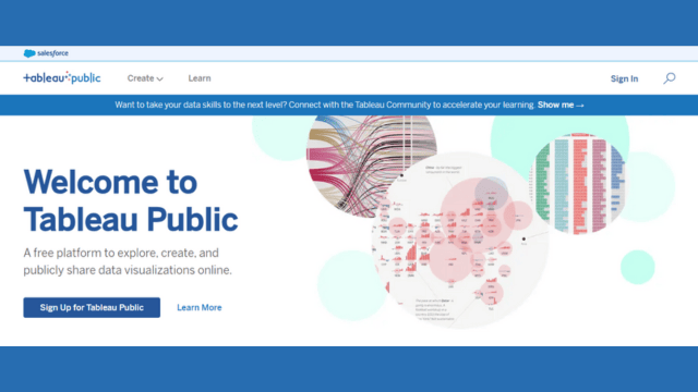
With the help of the robust and popular free data visualization tool Tableau Public, anybody and any organization can make engaging and interactive data visualizations for no cost. Tableau Public, created by Tableau Software, enables users to quickly turn unstructured data into meaningful dashboards, charts, and interactive maps. It is intended to increase data accessibility and engagement.
Key Features of Tableau Public
The following are some essential key features of this tool:
Drag-and-Drop Interface that is Simple
Tableau Public’s user-friendly interface makes it simple for novice and seasoned analysts to connect, explore, and visualize data by dragging and dropping items.
Numerous Data Connections
The platform supports various data sources, including databases, cloud services, spreadsheets, and more, enabling easy integration and analysis of various datasets.
Animated Dashboards
Users of Tableau Public may build dynamic, interactive dashboards that let users explore the data independently, helping them comprehend the insights provided more thoroughly.
Create and Distribute
Users of Tableau Public can publish their visuals to the Tableau Public server so anyone with a web browser can access them. It is a preferred option for data journalists, bloggers, and content producers because it is simple to embed in websites or share on social media.
Community and Partnership
The Public community is a fantastic source of ideas, knowledge, and opportunities for teamwork. Users can explore and interact with other people’s visualizations, provide and receive criticism, and learn from various datasets.
Adaptive Design
Tableau Public visualizations dynamically adjust to various screen sizes and platforms, providing a consistent and superior viewing experience on PCs, tablets, and smartphones.
Besides these features, here are some pros and cons of this tool:
Pros
- Tableau Public is accessible to many users thanks to its free availability.
- Tableau Public makes it possible for viewers to engage with the data.
- It supports a variety of data sources, enabling flexible analysis.
- Users have access to a thriving community for learning and inspiration.
- Visualizations can be readily shared on websites and social media channels.
Cons
- Tableau Public requires an internet connection to function, restricting its use for sensitive data because visualizations are, by default, public.
- The quantity of data that can be uploaded and analyzed is limited.
- Visualizations may include Tableau branding, which may not be appropriate in business situations.
Google Data Studio
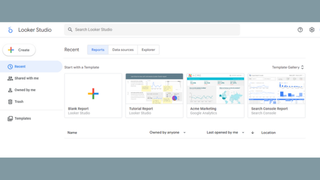
Google’s data reporting and visualization tool is called Google Data Studio. With Data Studio, individuals and organizations can quickly transform unprocessed data into engaging reports and dashboards.
Data Studio is an excellent option for data-driven decision-making and data analysis because it seamlessly connects with other Google services like Google Analytics, Google Ads, and Google Sheets as part of the Google Marketing Platform.
Key Features of Google Data Studio
The following are some essential key features of this tool:
Drag-and-Drop Interface
Users may easily create and customize visualizations using Data Studio’s user-friendly interface by dragging and dropping data items.
Connectivity to Data Sources and real-time interaction
Various data sources, such as Google services, SQL databases, and other cloud-based data platforms, can be seamlessly integrated with the platform. Interactive reports and dashboards from Data Studio let users explore and engage with data in real time.
Coordination of an individual visualization
Users can collaborate on reports, distribute them to stakeholders or other team members, and manage access rights. Users can generate distinctive and customized reports using the customization tools and various visualization options offered by Data Studio.
Available on All Devices
For a consistent user experience, reports made in Data Studio are responsive and accessible on PCs, tablets, and smartphones.
Pros
- It connects seamlessly with numerous Google services and other data sources, easing data import.
- It is free, making it accessible to enterprises and people of all sizes.
- Multiple users can work together simultaneously to create reports quickly and effectively.
- Google updates Data Studio frequently, incorporating new functions and enhancing performance in response to user input.
Cons
- When handling massive data sets or complex calculations, Data Studio may run into problems.
- Users may need to combine Data Studio with other specialized tools for advanced statistical analysis.
Microsoft Power BI Desktop
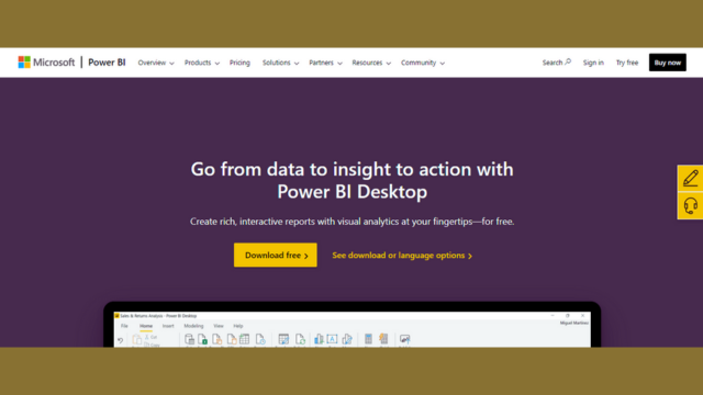
A powerful and complete business intelligence and free data visualization tool created by Microsoft is called Power BI Desktop. It is intended to assist companies and analysts in turning unprocessed data into valuable and engaging reports, dashboards, and data visualizations.
Power BI Desktop enables users to get deeper insights into their data and make data-driven decisions that lead to business success because of its user-friendly interface and strong features.
Key Features of Microsoft Power BI Desktop
The following are some essential key features of this tool:
Connectivity to data
Power BI Desktop allows users to connect to and import data from various data sources, including Excel spreadsheets, SQL databases, cloud-based services like Azure, and more.
Transformation of Data
Within the program, users can clean, shape, and convert data to ensure it is in the format needed for analysis and display.
Animated Interactive Displays
Charts, graphs, maps, and tables are a few visualization tools available in Power BI Desktop that can be adjusted to produce dynamic and aesthetically pleasing reports.
DAX Calculations
Users can develop sophisticated calculations and measures for in-depth analysis using the Data Analysis Expressions (DAX) language in Power BI Desktop.
Cross-platform integration and instant update
The visualization tool allows users to produce reports and dashboards that can be shared and seen on several devices, like desktop computers, tablets, and smartphones. Power BI Desktop can connect to real-time data sources, guaranteeing that reports and dashboards show the most recent data.
Besides these features, here are some pros and cons of this tool:
Pros
- Power BI Desktop offers seamless interaction with a variety of data sources.
- It allows users to perform data shaping and cleaning operations.
- The powerful BI Desktop allows users to interact with data, enabling more thorough investigation.
- Users can construct intricate calculations and unique measurements using the DAX language.
- Power BI Desktop suits small and large businesses and can handle massive datasets.
Cons
- It can handle massive datasets; particularly complicated data models may perform slower.
- For certain users, mastering the sophisticated features of Power BI Desktop may take time and effort.
- Power BI Desktop’s limited offline functionality is caused by its heavy reliance on cloud-based services.
Chart.js
A well-liked open-source JavaScript library called Chart.js makes it easier to make stunning and dynamic data visualizations for the web. With its ease of use and adaptability, Chart.js has emerged as the go-to option for developers and data specialists looking to present data appealingly and interestingly.
Chart.js gives you the power to quickly and easily visualize your data, whether you need to present complicated datasets or straightforward charts.
Key Features of Chart.js
The following are some essential key features of this tool:
Easy Integration
Simple Integration Developers can get going quickly using Chart.js because it is small and simple to incorporate into websites and web apps.
Adaptive Design
To guarantee a consistent user experience across all devices, the library automatically modifies the charts’ size and style to accommodate different screen widths.
Multiple Chart Types
Chart.js provides various chart formats to meet data visualization requirements, including line, bar, pie, radar, and more.
Choices for Customization
Charts’ appearance and functionality can be readily customized by developers, allowing them to coordinate the charts with the application’s overall design.
Interactivity along with browser support:
The library offers interactive elements that improve user interaction and comprehension of the data, such as tooltips and animations.
Besides these features, here are some pros and cons of this tool:
Pros
- It is simple to set up and operate, making it suitable for developers of every level.
- The charts provide a smooth experience on various devices by automatically adjusting to different screen sizes.
- Developers can readily modify chart functionality and look to meet their requirements.
- Chart.js is a lightweight library that speeds up performance and reduces page load times.
- Data exploration is fascinating and user-friendly, thanks to interactive tooltips and animations.
- Because of the library’s thorough documentation, developers may quickly locate answers and examples.
Cons
- Chart.js doesn’t natively support complicated 3D displays.
- While Chart.js supports modern browsers, it may have limited support for older versions.
- Some advanced data visualization features may need extra plugins or custom programming.
- Due to possible performance issues, Chart.js may be a better option for real-time data visualization.
Datawrapper
With the help of the robust online accessible data visualization tool Datawrapper, anyone, including journalists and businesses, can quickly and easily create eye-catching, interactive charts, maps, and tables. Datawrapper, introduced in 2011, has gained popularity as a tool for data-driven storytelling.
Datawrapper Enables people to show complex data in a simple and aesthetically pleasing way without requiring highly developed technical expertise. Datawrapper’s user-friendly interface and extensive customization options allow users to successfully communicate insights to their audiences by bringing their data to life.
Key Features of Datawrapper
The following are some essential key features of this tool:
Friendly User Interface
Moreover, without a technical or design experience, users can easily input data and create visualizations using Datawrapper’s user-friendly drag-and-drop interface.
Responsive Design
A smooth experience on PCs, tablets, and smartphones is made possible by Datawrapper’s visualizations’ responsive design, which adjusts to different screen sizes.
Animated Interactive Displays
When using Datawrapper, users can explore the data and obtain better insights thanks to interactive features like tooltips and legends.
Customization and data integration
Users may quickly alter the visual appearance of their charts, maps, and tables to reflect their branding or design requirements. The process of importing and updating data is simplified by Datawrapper’s seamless integration with various data sources like Excel and Google Sheets.
Regular Updates
Datawrapper automatically updates the visualizations as the underlying data is modified, saving time and effort in maintaining precise charts. Besides these features, here are some pros and cons of this tool:
Pros
- Simple to use interface for creating visualizations.
- Interactive components for better engagement, such as tooltips and legends.
- Responsive design which guarantees a consistent user experience across all platforms.
- Supports a variety of chart types to depict different types of data.
- Easy data connection with sources like Excel and Google Sheets.
- Visualizations are updated automatically when the underlying data changes.
Cons
- Few advanced Features are only available in premium plans.
- It runs as a web-based application. Thus, customization choices may be limited in the free edition.
- A Tool also requires internet access.
- For particular reasons, export options could be subject to certain restrictions.
Plotly
Plotly is a well-known open-source data visualization tool that enables everyone, including scientists, engineers, and data analysts, to produce beautiful and engaging visuals for data exploration and narrative storytelling.
Its ability to make data come to life through dynamic charts, graphs, and maps has helped it become highly well-liked in the data science community because of its user-friendly interface and broad capabilities. Plotly provides a potent set of tools to efficiently display insights and patterns, regardless of whether you’re visualizing straightforward datasets or intricate analytics.
Key Features of Plotly
The following are some essential key features of this tool:
Animated Interactive Displays
The tool offers a variety of interactive features, including zooming, panning, and hover effects, allowing users to dig deeper into the data.
Versatility
Plotly provides several chart kinds, including scatter plots, line charts, bar charts, histograms, heatmaps, and 3D visualizations to meet various data representation requirements.
Dynamic and Real-Time Updates
It is suited for streaming data and dynamic applications because users can build real-time visualizations that refresh automatically as new data becomes available.
Online and Offline Use
Plotly offers flexibility for various workflows because it can be used offline in Python, R, or MATLAB environments and online through its web-based platform.
Apps and dashboards
Users can create interactive web-based dashboards and applications using Python by leveraging Plotly’s Dash framework, which enables seamless data presentation and analysis.
Coordination and Exchange
Plotly users can easily share and collaborate on visualizations, making it simple for groups and individuals to work on data projects together.
Besides these features, here are some pros and cons of this tool:
Pros
- Offers a wide variety of chart formats for different data visualization
- Highly interactive for deeper data study.
- Supports dynamic applications’ real-time data visualization.
- Works nicely in environments like Python, R, and MATLAB.
- Aesthetics that can be customized to fit branding or design preferences.
- A vibrant community with resources for learning and assistance.
Cons
- The learning curve for learning sophisticated features.
- An effect of massive datasets on performance.
- Cloud-based services are necessary for online functionality.
- There are some restrictions when compared to the web-based version in offline mode.
Infogram
A robust and user-friendly data visualization and infographics tool, Infogram enables people, companies, and organizations to produce engaging visual narratives using their data. As a user-friendly platform for producing interactive charts, infographics, maps, and reports without substantial design or technical expertise, Infogram has grown in popularity.
Thanks to its drag-and-drop interface, a comprehensive collection of templates, and data visualization tools, Infogram enables users to transform complex data into aesthetically beautiful and easily understandable content for various applications.
Key Features of Infogram
The following are some essential key features of this tool:
Friendly User Interface
Customers of all skill levels, from novices to professional designers, may utilize Infogram thanks to its user-friendly drag-and-drop interface.
Numerous Visualizations and customization
Infogram allows customers to select the most appropriate visual representation of their data from various chart formats, infographics, and maps. Users may quickly change fonts, layouts, colors, and other design aspects to reflect their personal preferences or brand branding.
Active Components
Viewers can examine data and engage with the material by interacting with interactive visualizations and infographics made possible by Infogram.
Data Integration and Import
The platform streamlines the data integration by enabling input from various sources, including Excel, Google Sheets, and cloud-based services.
Coordination and Exchange
The data visualization makes it easier for groups to collaborate on projects simultaneously and provides simple sharing options for distributing material to viewers.
Responsive Design
Infogram visualizations employ responsive design to adjust to various screen sizes and input methods, providing a fluid user experience on PCs, tablets, and smartphones.
Besides these features, here are some pros and cons of this tool:
Pros
- Simple to use interface for infographic and data visualization.
- A vast collection of templates for efficient and expert content creation.
- Interactive components that increase user interaction and data exploration.
- Effective data incorporation through seamless data integration from several sources.
- Tools for teamwork on projects that promote collaboration.
- The responsive design guarantees a consistent user experience across all platforms.
Cons
- The free plan has few features in comparison to premium ones.
- The free version may have fewer customization possibilities.
- Restrictions on data processing for large or complex datasets.
- Because it’s an online tool, it needs an internet connection.
RAWGraph
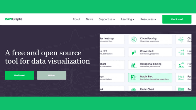
It is a cutting-edge and imaginative tool for data visualization that enables users, designers, and data specialists to produce excellent and distinctive data representations. RAWGraph, introduced by the DensityDesign Research Lab in 2013, is notable for its emphasis on aesthetics and capacity to transform unprocessed data into exquisite, creative visual representations.
The tool gives customers the tools they need to create data visualizations that effectively communicate insights, arouse viewers’ emotions, and keep them interested like never before.
Key Features of RAWGraph
The following are some essential key features of this tool:
Visual artistry
RAWGraph places a significant emphasis on aesthetics, allowing users to produce unique data visualizations that are artistic and visually appealing.
Intuition and simplicity
Users without coding or design knowledge can utilize the application because of its user-friendly interface. RAWGraph offers a wide range of customization options that let users fine-tune the look, feel, and styles of visualizations to match their creative vision.
Different Chart Types
The platform supports various chart formats, from straightforward bar charts and line graphs to more distinctive and artistic representations like circular dendrograms and circle packing layouts.
Import and Export of Data
Clients of RAWGraph can export the visualizations as SVG or PNG files for use in other projects and ingest data from various file types.
Live Preview and Participation
Users can engage with their visualizations in real-time previews while being created, allowing for iterative design and exploration.
Besides these features, here are some pros and cons of this tool:
Pros
- Beautiful and artistic data visualizations.
- An intuitive user interface.
- Numerous opportunities for customization.
- Special and distinguishable chart types.
- Flexible import and export of data.
- During creation, interactive real-time previews.
Cons
- The handling of complex data is limited.
- Prioritize aesthetics before cutting-edge analytics.
- The need for integrated collaborative tools.
- It needs an internet connection to be used online.
D3.js
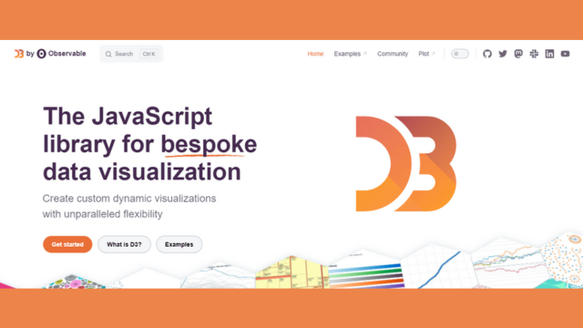
A well-liked and potent JavaScript toolkit for building dynamic with interactive data visualizations on the web is called D3.js, short for Data-Driven Documents. Mike Bostock created D3.js, which has become the go-to option for programmers and data specialists wishing to create unique and complex data visualizations that can be easily included in websites and web apps.
D3.js provides unmatched flexibility and control for building data-driven visualizations that successfully convey insights thanks to its capacity to connect data to the Document Object Model (DOM) and edit elements using HTML, SVG, and CSS.
Key Features of D3.js
The following are some essential key features of this tool:
Data manipulation and binding
Data can be bound to HTML or SVG elements with D3.js, allowing for dynamic display updates based on changes in the underlying data.
Control and Personalization
Developers have complete control over the look and feel of visualizations, enabling them to design distinctive charts and visuals with a high degree of customization.
Numerous Options for Data Visualization
D3.js offers various alternative data representations, such as bar charts, line charts, scatter plots, heat maps, network graphs, and more.
Animations and transitions
The library offers fluid animations and transitions, which improve user experience and give data visualizations a more eye-catching appearance. Users may explore and engage with the data thanks to D3.js’s ability to add interactivity and event handling to visualizations.
Extensibility and Community
Because of the active contributions from the tool community, this data visualization tool is always developing and becoming more potent.
Besides these features, here are some pros and cons of this tool:
Pros
- For developing unique data visualizations, D3.js provides unmatched control and customization choices.
- The library supports a wide range of chart types and data representation strategies.
- D3.js enables programmers to construct interactive, dynamic visualizations that adapt to user input and data changes.
- It allows for the creation of responsive visualizations, ensuring device compatibility.
- The tool gains from a thriving community that offers helpful materials and ongoing development.
Cons
- Complex code may result from highly tailored visuals, compromising maintainability.
- When compared to alternative charting frameworks, utilizing D3.js may need to be more efficient for straightforward charts and visualizations.
- The performance and load times of sophisticated visualizations with numerous elements may be affected.
Qlik Sense
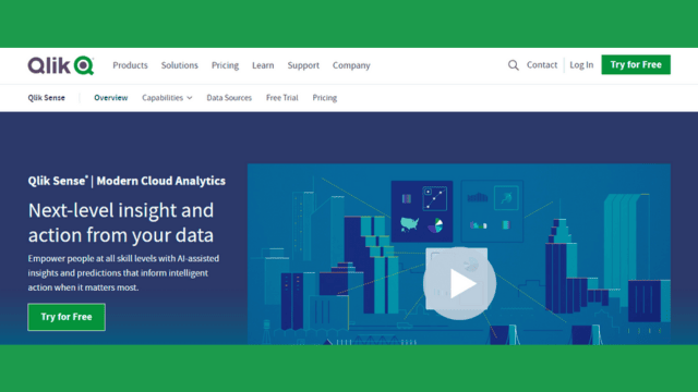
How businesses unearth insights and make data-driven choices is revolutionized by Qlik Sense, a top platform for business intelligence and data visualization. Users may build interactive and dynamic visualizations without sophisticated programming or data modeling abilities. Also, analyze data and derive insightful conclusions with Qlik Sense, a product of the well-known data analytics business Qlik.
Qlik Sense transforms how businesses comprehend their data and maximize performance by giving people of all skill levels the tools they need to transform raw data into actionable intelligence.
Key Features of Qlik Sense
The following are some important key features of this tool:
Relational Data Model
Moreover, Qlik Sense uses an associative data model, so users can explore data relationships without being restricted by drill paths or established hierarchies.
Interface using Drag and Drop
Users can easily create sophisticated visualizations and dashboards without coding knowledge using the platform’s user-friendly drag-and-drop interface.
Dynamic Data Analysis
The tool users can interact with visualizations by choosing and connecting data points in real time to quickly learn new information.
Smart Search and Natural Language Interaction
Qlik Sense’s smart search feature enables users to ask queries in any language and receive instant visual answers, accelerating data discovery.
Adaptive Design
The responsiveness and adaptability of Qlik Sense visualizations to different screen sizes and devices ensure a consistent user experience.
Data storytelling
Qlik Sense’s feature enables users to construct data narratives by fusing graphics with commentary and insights to deliver engaging data-driven tales.
Data Connectivity
The platform offers connectivity to various data sources, including databases, spreadsheets, the cloud, and web data connectors, allowing seamless data integration.
Advanced Analytics Integration
Integrating advanced analytics models and algorithms into Qlik Sense makes deeper data analysis and predicted insights possible.
Coordination and Exchange
Users can effortlessly collaborate and make data-driven decisions throughout the enterprise by sharing visualizations, apps, and insights with coworkers.
Besides these features, here are some pros and cons of this tool:
Pros
- The associative engine gives consumers the freedom to explore data relationships freely.
- All users can access data visualization thanks to a simple drag-and-drop interface.
- Users can engage with visualizations and perform in-depth data analysis right away.
- Data discovery is sped up by smart search using natural language queries.
- For a consistent user experience, visualizations are responsive to different devices.
- Users can develop compelling narratives using data storytelling capabilities.
Cons
- The cost of Qlik Sense may be more than that of specific other data visualization tools.
- Some users may need additional time and training to master its complex capabilities and analytics integration.
- Large or complicated datasets may need rigorous data modeling to guarantee the best performance.
Buying guide for free data visualization tools
Buying guides are frequently employed when investing in expensive goods or services. However, there is no need for a conventional buying guide because free data visualization tools are offered without charge. Alternatively, we may advise you on picking the best free data visualization tool for your requirements. Here are some factors to consider:
Effortless Use
Choose a tool that has a simple, user-friendly interface. It should have a simple learning curve that enables visualization creation without requiring in-depth technical expertise.
Sources and Formats of Data
Verify if the product is compatible with your frequently used data sources and file types. Ensure it can access databases, cloud storage, spreadsheets, and other pertinent sources.
Types of Visualizations: Consider the kinds of visualizations you must produce. Choose a tool that fits and meets unique needs because some may be more adept at creating specific sorts of charts or graphs.
Choices for Customization
Search for tools that permit a lot of flexibility. You can make aesthetically appealing and distinctive visualizations by modifying the colors, fonts, labels, and other components.
Interaction and Exchange
Ensure the tool supports interactive visualizations so visitors can further examine the data. Additionally, sharing the visualizations with others via links or embed codes is simple for you.
Data Privacy and Security
Ensure the product complies with security requirements and provides privacy settings to control data visibility if your data contains sensitive information.
Community and Assistance
When you encounter problems or require assistance, vibrant communities, and excellent customer service can be helpful tools. Look at the community and support possibilities for the tool.
Scalability and Efficiency
Take into account how well the tool performs when handling massive datasets. There can be restrictions on the amount of data or the processing speed for some tools.
Integration of Additional Tools
Check if the data visualization tool interfaces effectively with any other business intelligence or data analysis technologies you may use.
Recent Developments
Search for tools that are frequently improved and created. As a result, they remain current and may eventually add new functionality.
Although the tools are free, remember to read the terms of service and privacy policies to be aware of any potential limits, data usage regulations, or limitations. Finally, test out a few possibilities before deciding which suits your requirements and preferences best.
Frequently asked questions
Here are the FAQs about the best free data visualization tools:
Q: What are the free tools for data visualization?
A: Users can generate visual representations of data using charts, graphs, maps, and other elements utilizing free data visualization tools, which are software apps or platforms. Users can present data in a more understandable and accessible manner using these free tools.
Q: Why should users utilize free tools for data visualization?
A: Free data visualization tools are advantageous since they are reasonably priced, simple to use, and quickly reveal insights from data. They allow users to deal with multiple datasets from numerous sources, make data-driven decisions, and share interactive visuals with others.
Q: What kinds of visualizations can I produce with free data visualization tools?
A: Numerous visualization types, including bar charts, line graphs, pie charts, scatter plots, maps, and more, are available in most free data visualization software. The options that are offered may change depending on the particular tool.
Q: Can users use free data visualization software for work or profit?
A: Yes, many open-source tools for data visualization can be used for business and professional purposes. To ensure adherence to each tool’s usage guidelines, it is crucial to study the terms of service and licensing agreements.
Q: Are there any restrictions on utilizing free tools for data visualization?
A: Despite having valuable features, free data visualization tools could have some drawbacks compared to their premium equivalents. These restrictions could come in the form of fewer integration options, constrained data storage options, or fewer customization options.
Q: Is programming knowledge required to use free data visualization tools?
A: Many open-source data visualization tools include drag-and-drop capability and a user-friendly interface that lets users build graphs without any programming experience. However, some programs could include sophisticated capabilities that need little coding knowledge.
Q: Can users import data from diverse sources into free data visualization tools?
A: Yes, many free data visualization applications let users import data from several types of files, including databases, spreadsheets, cloud storage, and web services. For further information on the available data sources, consult the tool’s manual.
Q: Is my data safe and secure using free data visualization tools?
A: Your choice of tool affects the security of your data. Usually, trustworthy, accessible data visualization tools use security safeguards to protect data. When choosing a free data visualization tool, it’s critical to study the tool’s security capabilities and privacy practices.
Q: Can users use free data visualization software to share the graphics I produce with other people?
A: Most free data visualization tools allow you to share your representations. They can frequently be exported as image files or interactive web pages, or you can share them via links or embed codes.
Q: Do any online communities or resources exist for help with free data visualization tools?
A: Yes, there are a lot of active user communities for free data visualization tools where you can find tutorials, guidelines, and forums where you can ask questions or discuss ideas. Some tools include choices for customer service.
Q: Can users upgrade to a commercial version of an accessible data visualization tool to get more features?
A: Some programs for free data visualization also have commercial versions with more features, capabilities, and storage space. If the free version doesn’t meet your needs, consider the subscription choices for more sophisticated features.
Conclusion
Accessible data visualization tools have become essential in the current era of data-driven decision-making. These technologies give people and businesses an affordable approach to converting complex data into visually appealing and intelligible insights.
They let users quickly examine and interpret data, allowing for well-reasoned decisions. Despite expensive data visualization tools, everyone, regardless of their financial situation, can access data visualization thanks to the availability of feature-rich free alternatives.
Accessible data visualization tools allow users to connect to different data sources and efficiently present information. These tools have many features, from making interactive charts to producing thorough dashboards. These technologies are essential for uncovering insightful information and promoting wiser decision-making because they simplify complex facts through visual representations.
Whether on a tight budget or just beginning with data visualization, these free tools provide an excellent opportunity to harness the power of data and enhance understanding through impactful visualizations. Moreover, we have arranged the best free data visualization tools for users with outstanding features.
The top 3 are as follows:
- Tableau Public
- Google Data Studio
- Microsoft Power BI Desktop
Accessible data visualization tools turn unstructured data into visually appealing and helpful insights. These tools improve data accessibility, comprehension, and usability for individuals and enterprises by presenting information as charts, graphs, and maps.
Additionally, their user-friendly interfaces make it simple for non-technical users to produce powerful visualizations. These technologies facilitate data-driven approaches and speed decision-making by turning complex data into visual representations.
The interactive and shareable features improve collaboration and communication, making sharing insightful information with stakeholders easier. In the end, free data visualization tools are essential for enabling people to take responsibility for their actions and realize the full potential of their data.
When it comes to free data visualization tools, there is no need for a traditional buying guide, which is normally used for goods or services that require a cash investment. Instead, it’s essential to consider several aspects while selecting the right equipment.
Ensure the interface is user-friendly, works with your data sources, and supports the necessary visualization. Customization options, interactivity, and sharing possibilities are essential for developing powerful visualizations.
Next Article: Best Screenwriting Software For PC